moon d’elle
PROJECT(S)
Brand Identity, Website, Digital Marketing, & Packaging
MY ROLE
Visual Product Designer
SUMMARY
As the lead Visual Product Designer at moon d’elle, I played a central role in building the brand’s digital and physical presence from the ground up. My responsibilities included everything from user research and brand development to eCommerce UX/UI design, packaging design, marketing, and product photography. Working closely with the founders and collaborators, I helped turn a vision rooted in Italian craftsmanship and modern femininity into a cohesive, scalable, and luxurious online brand experience.
Background & Role
moon d’elle® is a startup luxury footwear brand on a mission to bring authentic Italian style to modern U.S. consumers through a seamless and elevated digital experience. With the motto "Live in the momento," the brand champions slowing down, savoring beauty, and making everyday moments luxurious.
As the sole designer, I owned end-to-end execution across multiple domains:
Conducted foundational UX research and persona development
Designed all brand identity assets and visual systems
Architected and prototyped the Shopify-based eCommerce site
Created all product photography, packaging, printed marketing collateral, and technical diagrams
Launched email and social media marketing campaigns
Designed event and PR collateral, including media kits and lookbooks
This project exemplified full-stack design leadership—balancing creative vision with practical constraints and user needs.
Brand Identity
TOOLS USED
Adobe Illustrator
Adobe InDesign
Logo Design
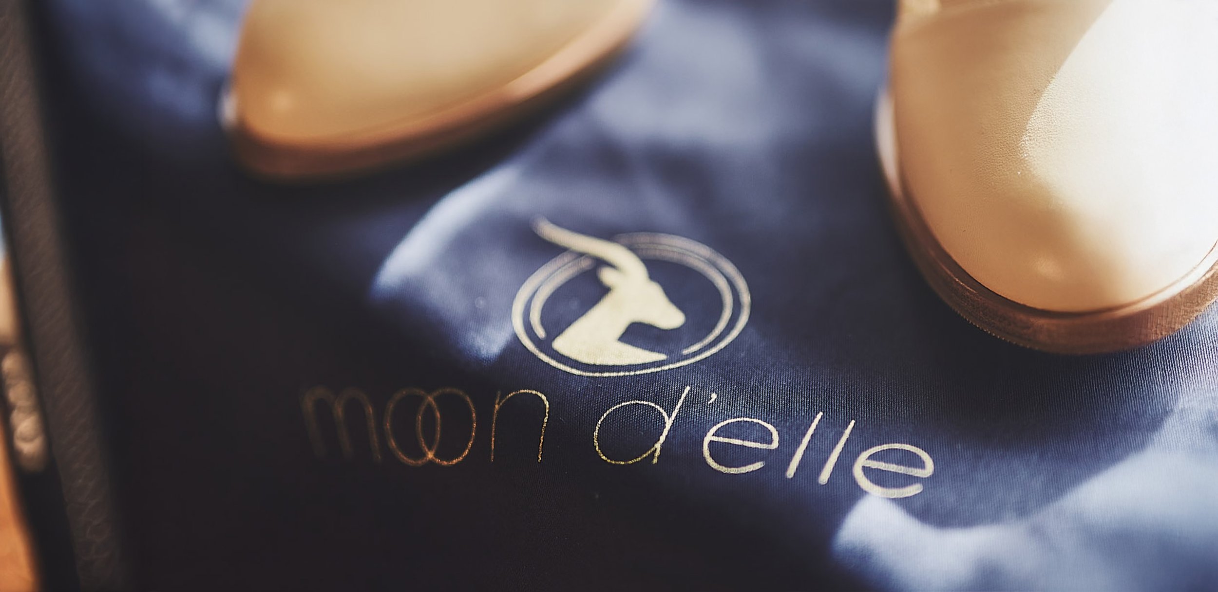
I began by crafting a distinct visual identity that reflected the founders' story and brand values. The brand name combines the meanings of Chandra (moon) and Tabitha (gazelle), forming a poetic blend of strength and grace.
Inspired by duality and balance, I created a logomark with two interlocking circles that reflect both partnership and elegance. A gazelle icon paired with a moon-inspired typeface honors the brand's namesake. The logotype features modern, rounded letterforms that mimic the gentle symmetry of a full moon.
Below you’ll see the logo’s evolution, from first explorations to the final lockups in horizontal and vertical forms.

FIRST ROUND OF LOGOS

REVISED ITERATION OF LOGOS

LETTERCASE VARIATIONS

FINAL LOGOS IN BOTH VERTICAL (STACKED) AND HORIZONTAL OPTIONS
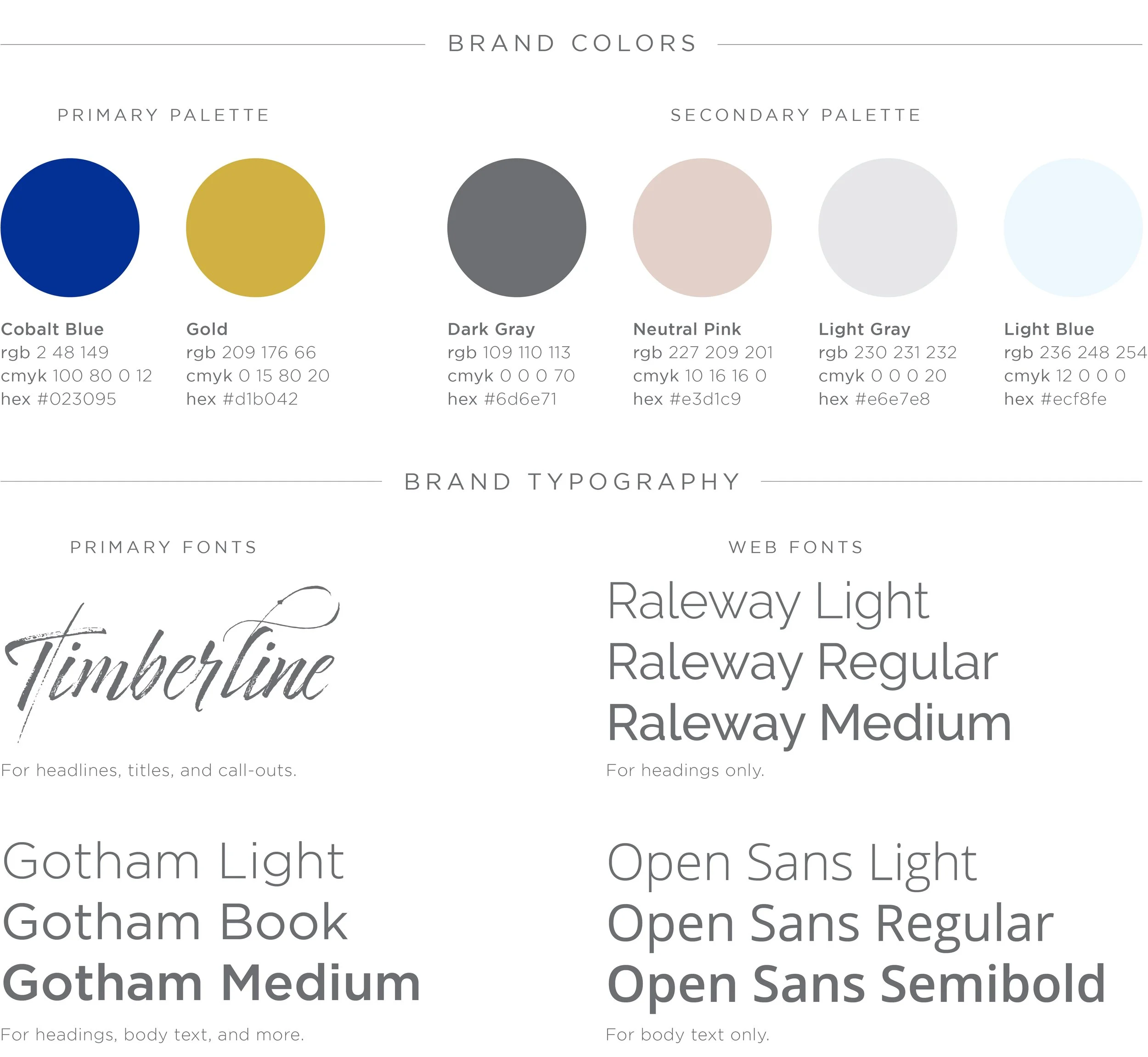
Typography & Color Palette
The palette includes cobalt blue and gold, accented with blush, gray, and cream tones. I selected fonts for both digital (web and mobile) and print usage to ensure elegance and legibility. Typography selections include:
Script font for headlines, titles, and call-outs
Sans-serif fonts for modern clarity and accessibility
Mood Boards & Pattern Design

Each mood board presented a distinct voice:
Option 1: Glamorous adventurer: bright blues, metallics, high-energy
Option 2: Earthy and intimate: neutrals, lace textures, dreamlike lighting
Option 3: Graphic and editorial: clean lines, bold contrasts, architectural elements
From geometric play to a lace-inspired visual asset used on packaging, web, and inserts, these mood board explorations were presented to stakeholders for final selection. Each board guided visual development across the digital and printed materials. Ultimately, we combined elements from options 1 and 3 to achieve an identity that felt grounded yet sophisticated.
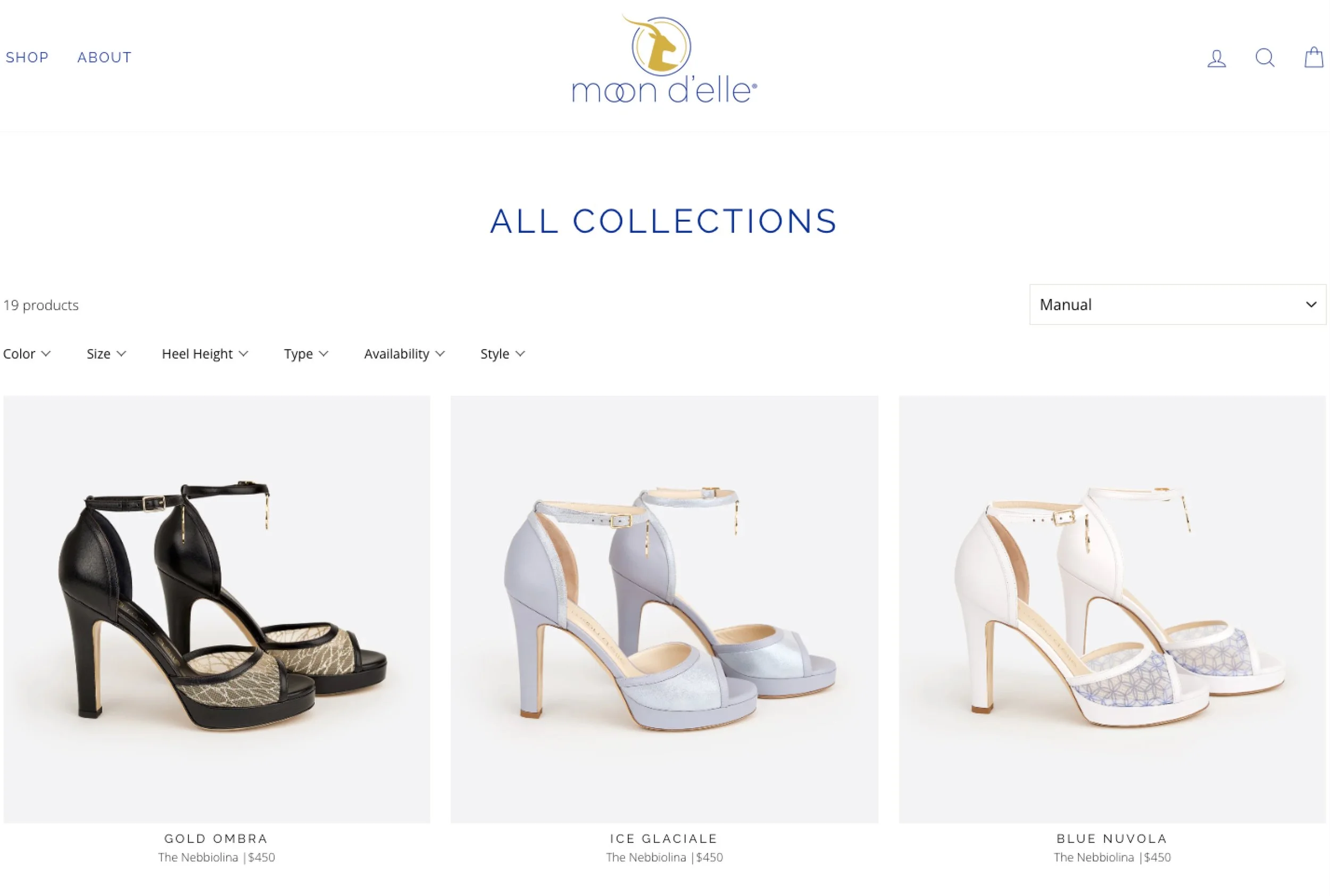
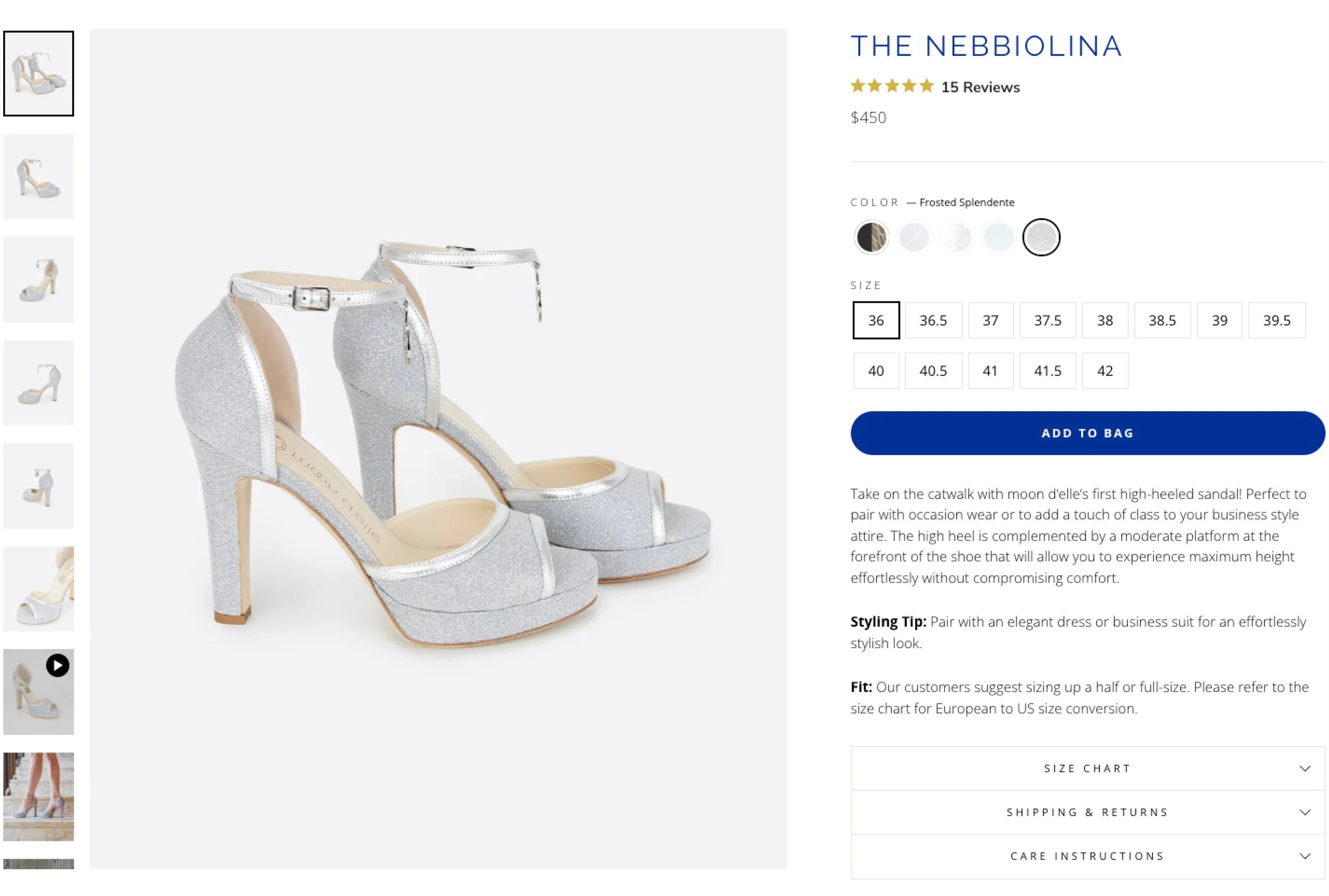
eCommerce Website
TOOLS USED
Adobe Illustrator
Adobe InDesign
Adobe Lightroom
Adobe Photoshop
Figma
Miro
Shopify
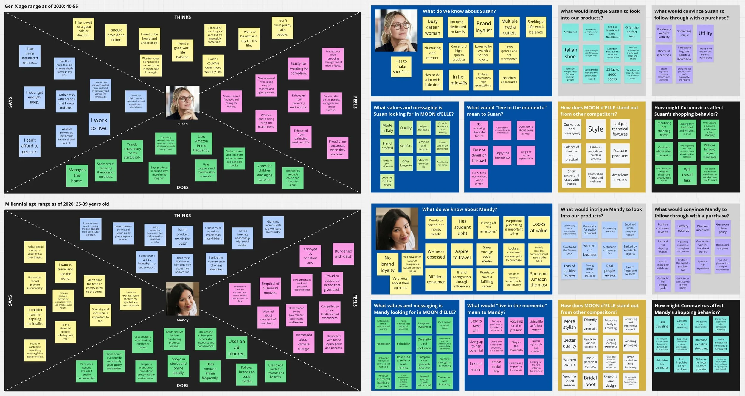
User Research and Strategic Planning
To ensure we built a user experience that aligned with our audience’s values, I facilitated a range of discovery activities:
Empathy mapping and persona development
Card sorting for IA testing
Behavioral analysis in response to COVID-19
Stakeholder interviews and journey mapping
We identified our primary customer personas as:
Millennial professionals seeking understated luxury
Women in transitional life stages (career changes, motherhood)
Conscious shoppers who value quality, transparency, and craft
I led workshops, empathy mapping, and card sorting exercises to understand our target demographics. During COVID-19, I facilitated a team strategy session to re-evaluate personas and address shifts in consumer behavior. The Miro board snapshots below shows the persona mapping, behavioral insights, and card sorting outputs.
User insights from Miro: emotional motivators, frustrations, and values that informed our design decisions.


Wireframes
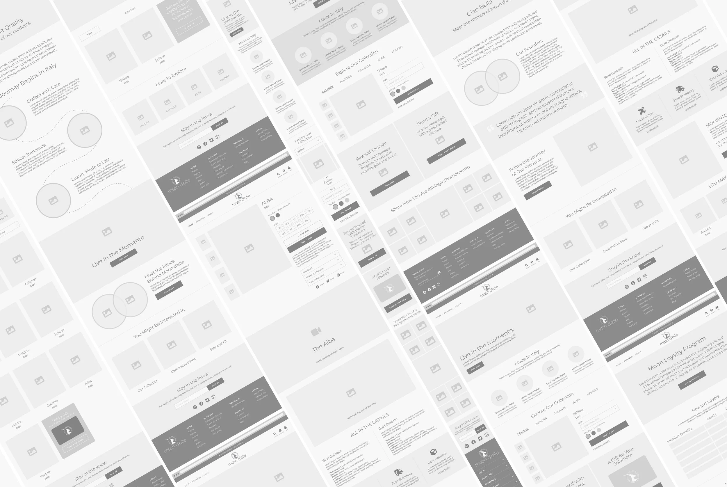
I developed the full Information Architecture and page structure for the site, designing wireframes for:
Homepage
Our Story
Collections
Product Detail
Fit & Sizing Guide
And More
Wireframes were created in Figma to test layout, hierarchy, and call-to-action placements before applying final visuals.
UI Design & Prototypes

OPTION 1: ADVENTURE SEEKING, ASPIRING, ACTIVE, MODERN, GLAM

OPTION 2: SELF DISCOVERY, PERSONAL, NATURAL, DREAMY, TEXTURAL

OPTION 3: PRODUCT CENTRIC, BRAND FOCUSED, PATTERNS, CLASSIC

FINAL ITERATION: COMBINATION OF OPTIONS 1 AND 3
I applied the mood board directions to high-fidelity mockups, allowing stakeholders to visualize the impact of visual tone on user experience. This also helped the founders envision seasonal updates and potential content strategies.
Custom Icon Set

To ensure consistency, I designed a custom suite of icons for content blocks like “Artisan Craftsmanship,” “Size Guide,” and “Care Tips.” These outlined icons complemented the brand’s clean, refined style. They’re designed to be minimalist, outlined icons used across the website, social media postings, and printed collateral.
Technical Diagrams & Illustrations
To help communicate the craftsmanship and design intent behind each product, I created detailed technical diagrams and illustrations that highlight the key features and construction of moon d’elle’s footwear. These visuals were used across the website and PR line sheets to educate customers, press, and retail partners about the materials, structure, and functional elements of each style. By translating complex product details into clear, visually engaging graphics, I supported both marketing and storytelling efforts while reinforcing brand credibility.
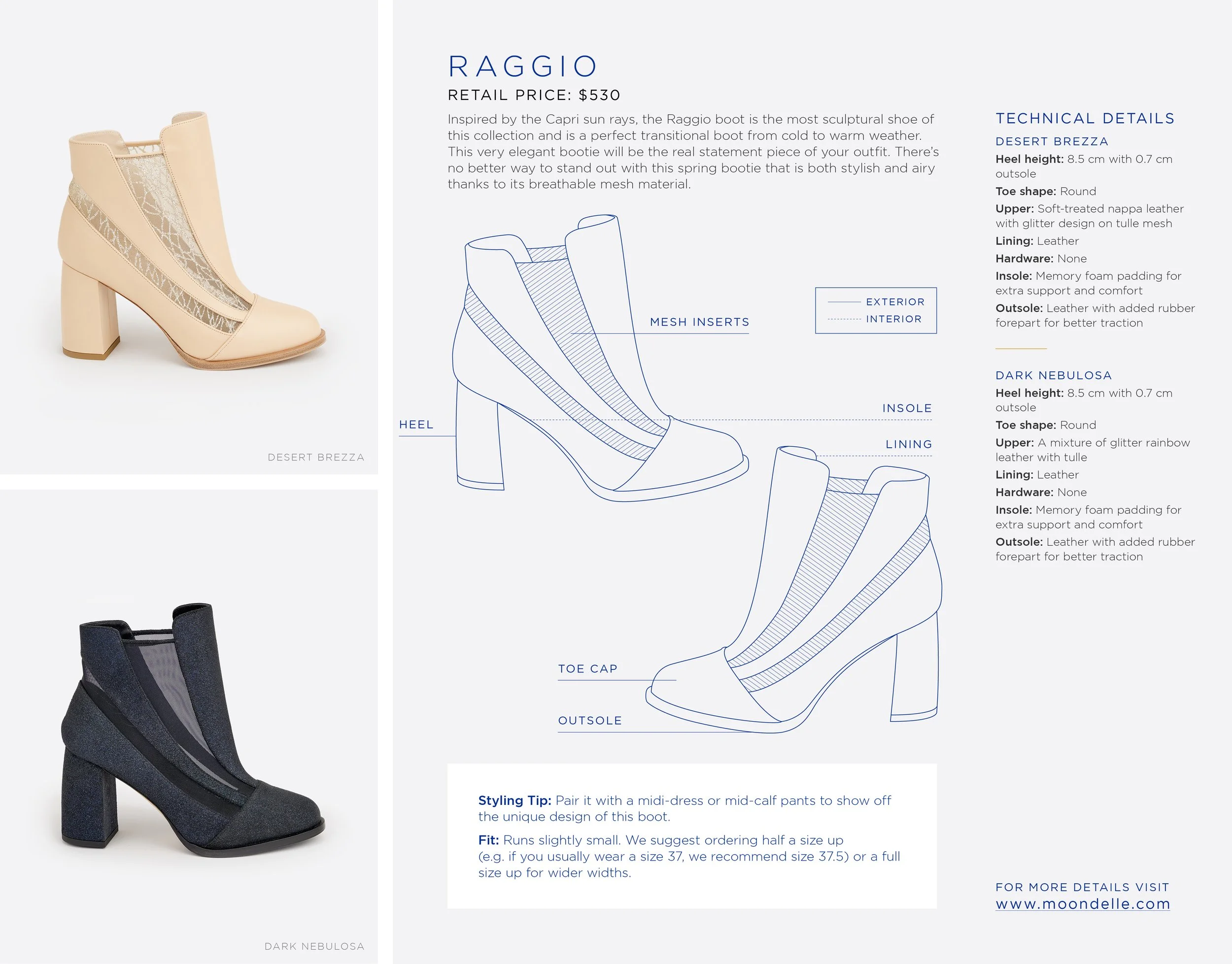

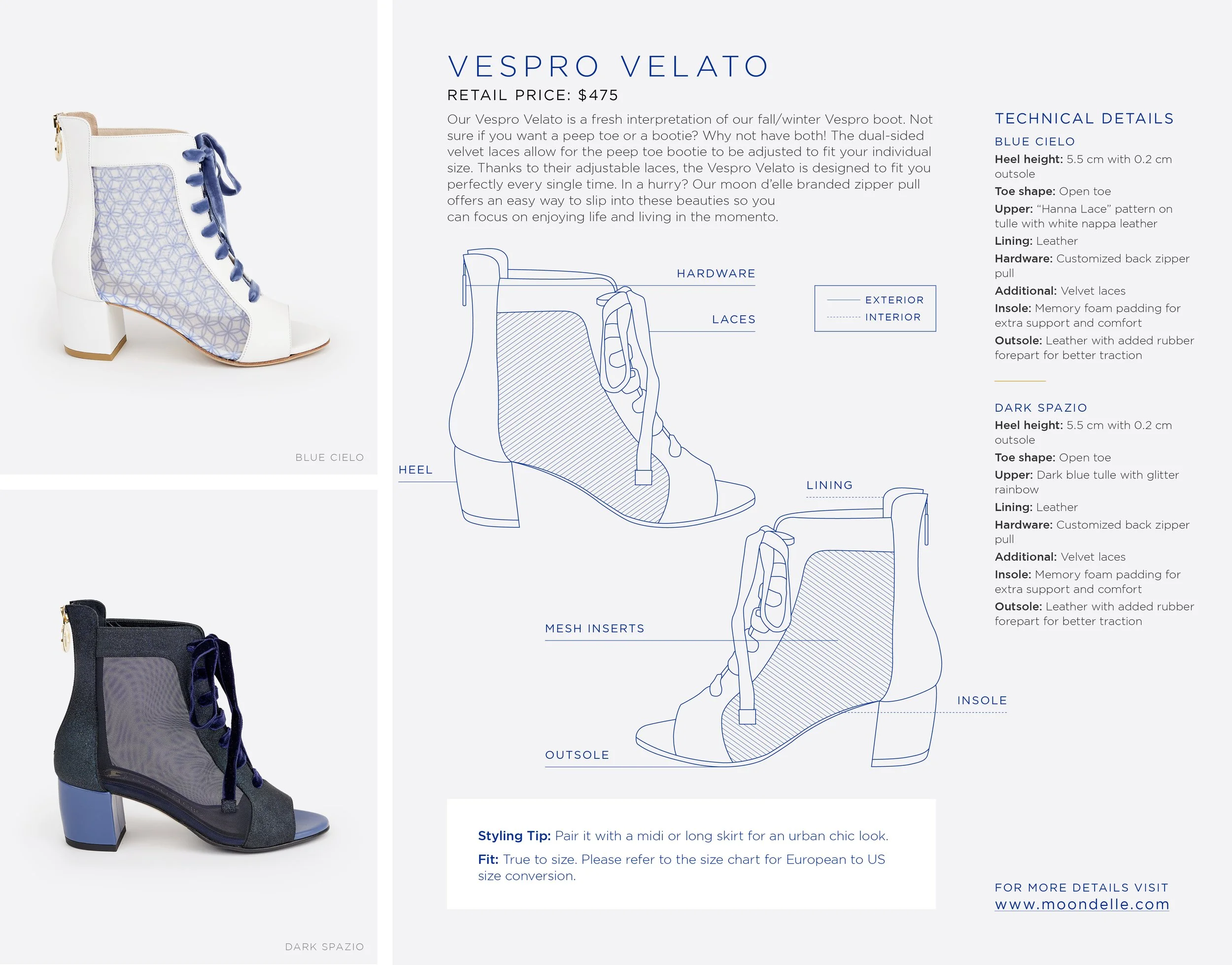
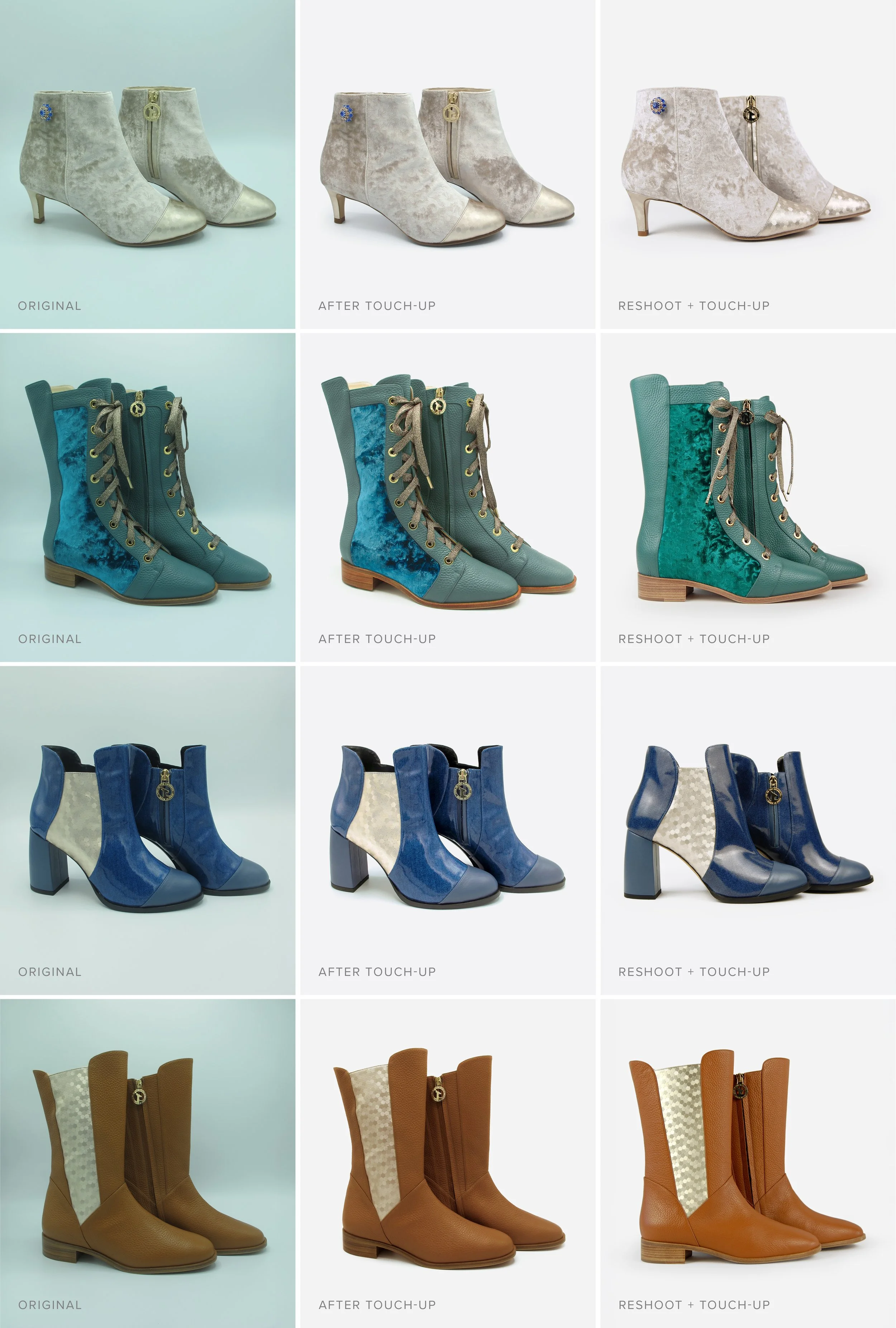
Photo Editing & Product Imaging
Original Photos
I received images of the prototype versions (before production) that needed substantial editing—background cleanup, lighting correction, and color balancing.
Reshoots
Using in-house equipment, I reshot the entire product line under controlled lighting to better reflect real-world color and texture.
Post-Production
Using Photoshop and Lightroom, I refined each image to ensure consistency and realism by removing creases, evening out shadows, and enhancing materials.
Implementation
To implement moon d’elle’s Shopify website, I partnered closely with a developer to build custom components using Shopify’s Liquid templating language. The developer created a flexible framework based on my high-fidelity Figma mockups, allowing me to upload design assets, input content, and structure each page with precision. I handled the visual layout and styling directly within Shopify, applying custom HTML and CSS where needed to align the front-end experience with our brand. Prior to launch, I conducted thorough QA testing across browsers, devices, and operating systems to ensure a seamless and responsive user experience.
Digital Marketing & Social Media
TOOLS USED
Adobe Photoshop
Adobe Illustrator
Adobe InDesign
Canva
Facebook
Instagram
Klaviyo
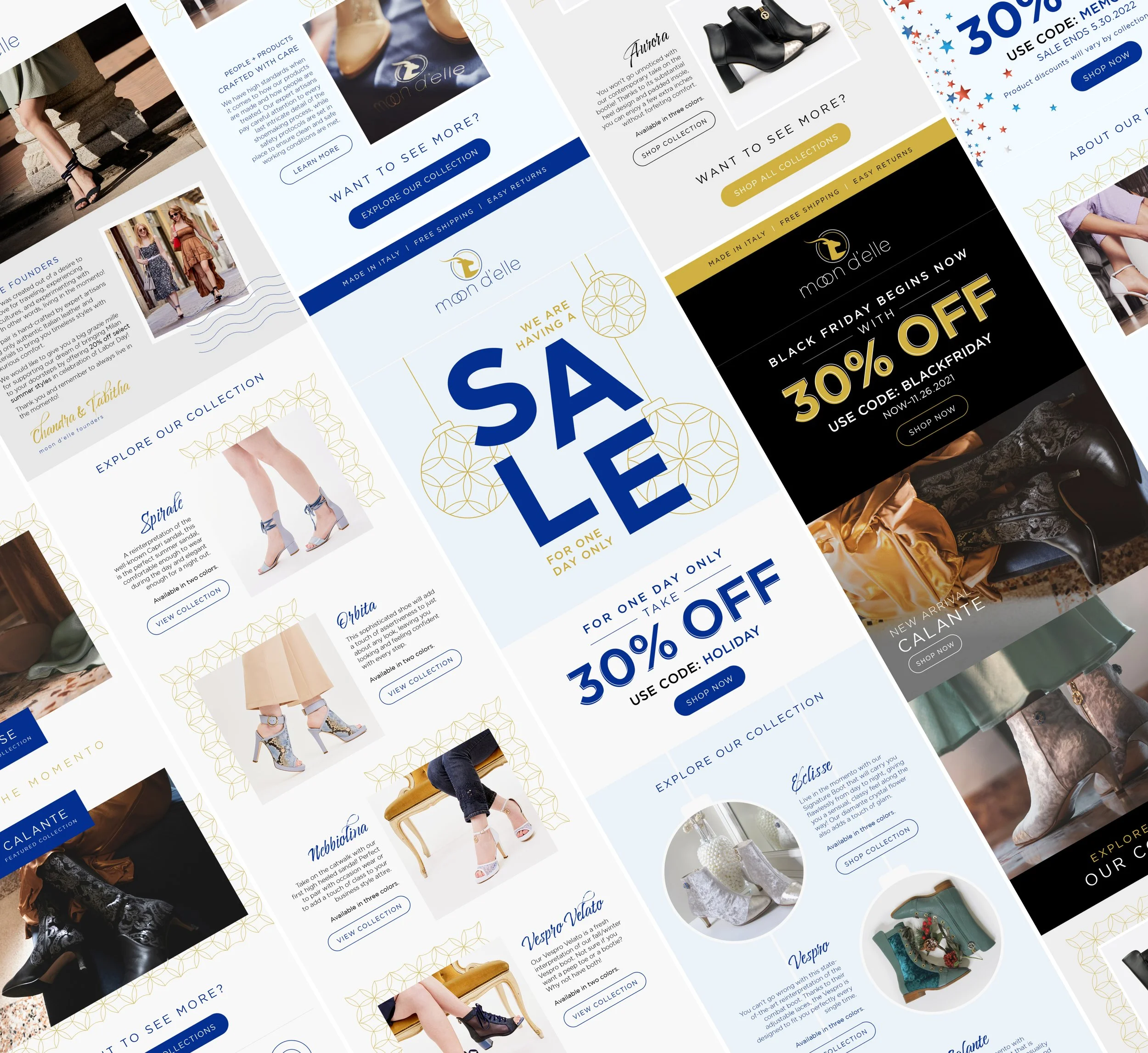
Email Campaigns
Built and automated email flows in Klaviyo including:
Welcome Series
Product Launch
Abandoned Cart
Post-Purchase
Designed each email using brand visuals, compelling copy, and responsive layout best practices.
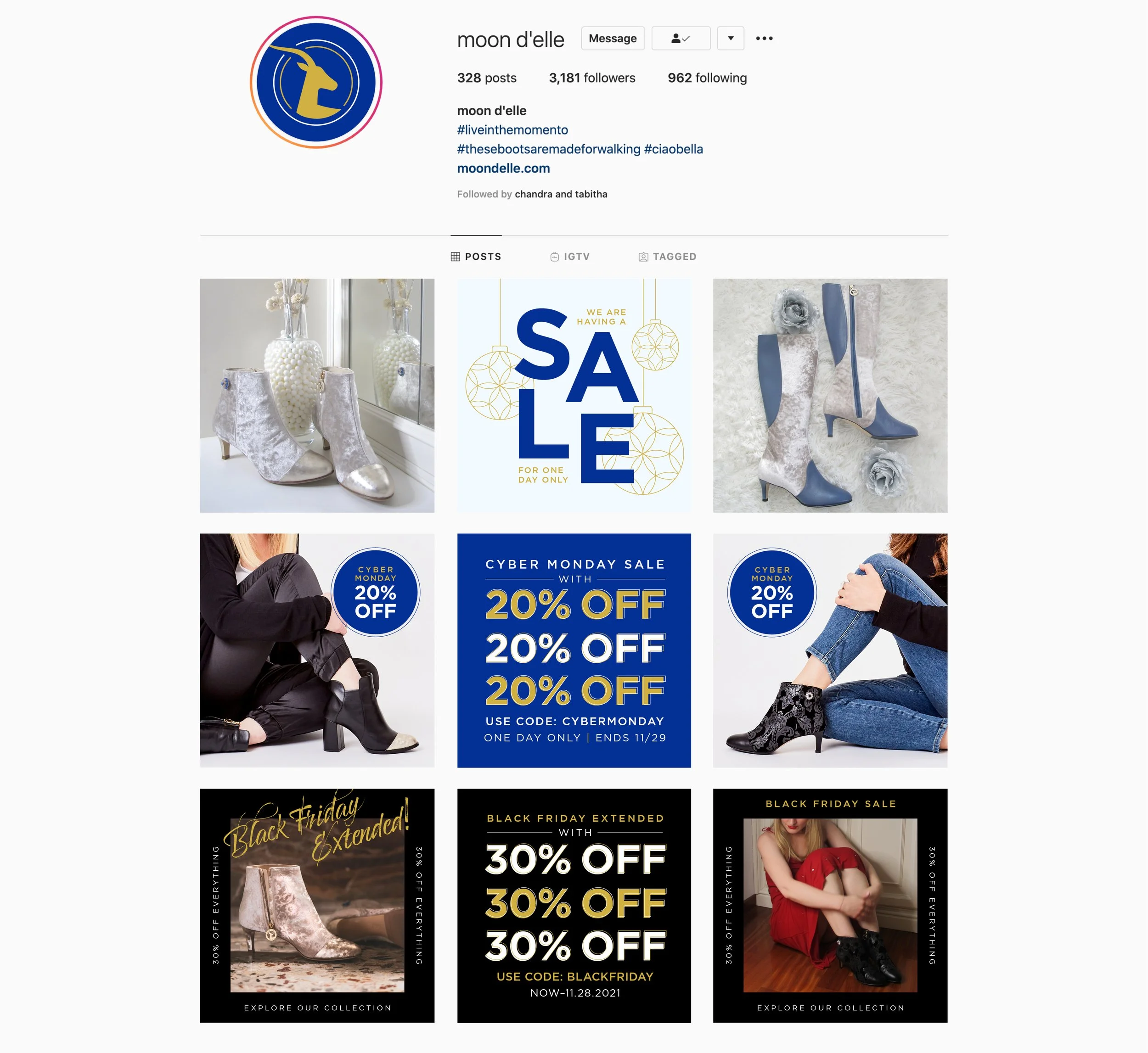
Social Media Assets
Created editable Canva templates to support ongoing campaigns and planned out 30-day calendars.
Posted content focused on:
Behind-the-scenes content
Product spotlights
Styling tips
Packaging & Print Collateral
TOOLS USED
Adobe Illustrator
Adobe InDesign
Adobe Photoshop
Event Create
Klaviyo
Packaging Design
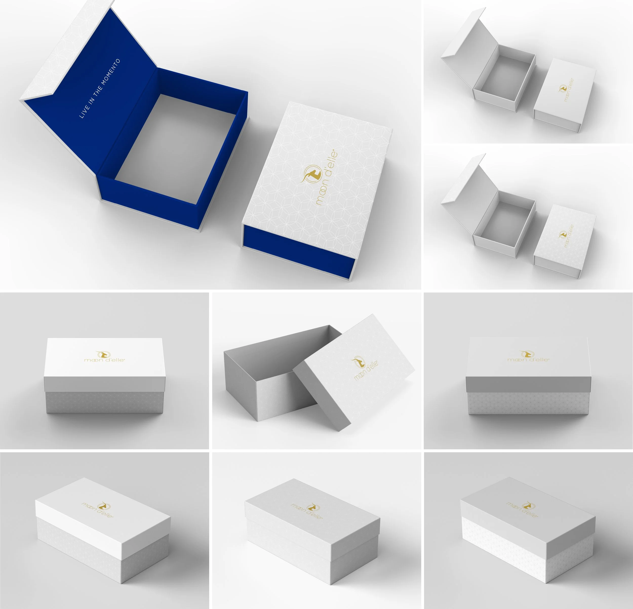

FINAL DIE-LINE FOR COLLAPSIBLE MAGNETIC PACKAGING
Researched multiple retail packaging options and print vendors to provide the most cost- and space-efficient solution that will also delight the recipient while keeping in line with the brand’s stance on sustainability. Detailed mockups were designed using Adobe Photoshop to mimic 3D renderings of the packaging designs with the finalized design executed in Adobe Illustrator for production.
Packaging Goals
Premium but cost-effective
Sustainable and easy to store/ship
Elegant unboxing experience
Design Deliverables
Rigid box with custom interior wrap
Gold foil sticker seal
Tissue paper with lace motif
Printed Inserts
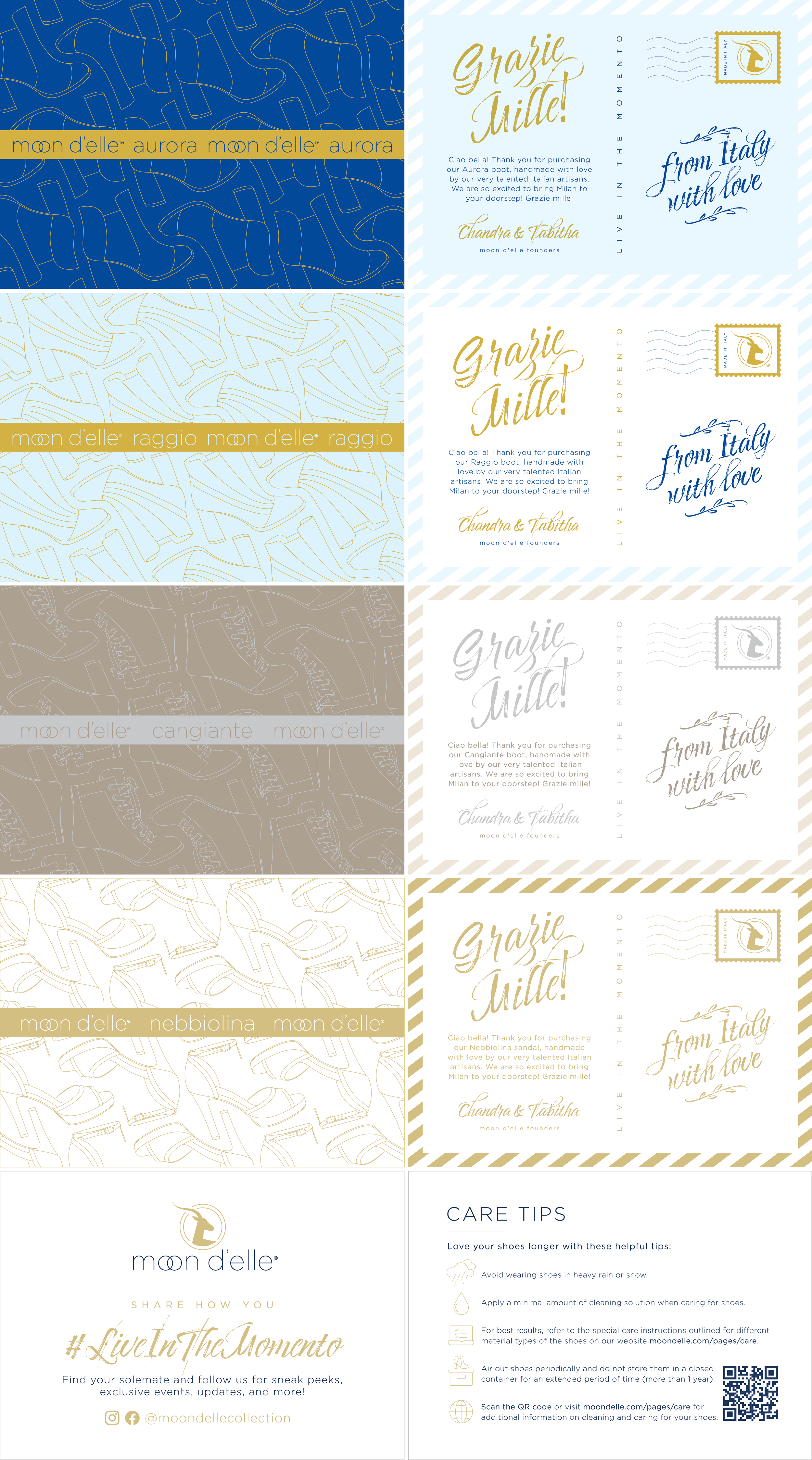
Each package included a suite of branded print materials:
A style-specific storytelling card
Care instructions
Social share prompt
Custom gold foil sticker seal
These inserts were designed to personalize the unboxing moment and reinforce the brand’s values.
Events & PR Collateral
TOOLS USED
Adobe Illustrator
Adobe InDesign
Adobe Photoshop
Event Create
Klaviyo
Event Launch Design

EVENT EMAIL INVITE (LEFT) AND EVENT WEBSITE (RIGHT)

DAY-OF-EVENT DISPLAY AND MATERIALS
Designed all visual touchpoints for the launch event:
Digital invitation and RSVP website
Event signage: posters, directional signs, product cards
Step-and-repeat and event-themed backdrops
Custom cookies and packaging
Media Kit & Lookbook

LINE SHEETS: 2022 S/S COLLECTION
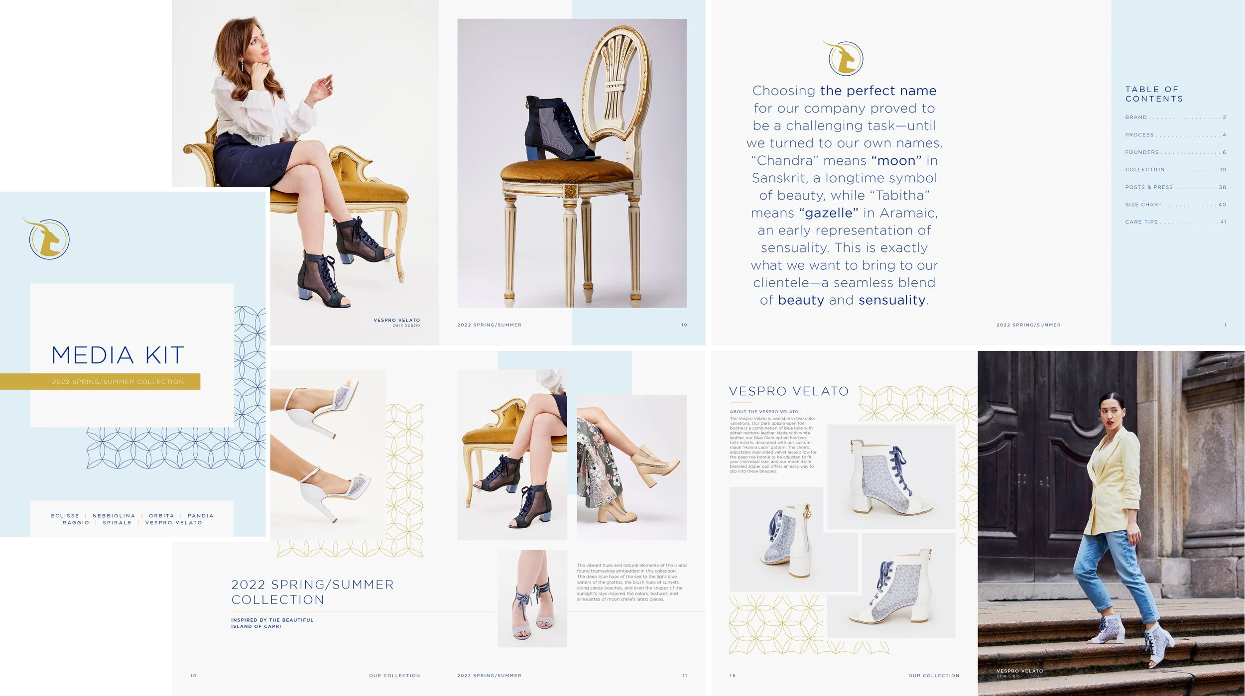
MEDIA KIT: 2022 S/S COLLECTION

MEDIA KIT: COVER OPTIONS
Created a cohesive media kit and line sheets for public relations and sales. Delivered branded downloadable PDFs used for press outreach and wholesale partners:
Media kit: brand story, press quotes, founder bios
Line sheet: product overview, materials, pricing tiers
Results & Takeaways
moon d’elle launched with a strong, coherent identity and a scalable design system that could grow with the brand. The Shopify site created a seamless shopping experience. Our initial marketing campaigns led to strong subscriber growth and product sell-through. The project was a rich example of holistic design, blending digital and physical touch points in a way that felt authentic, elevated, and intuitive.
This project was a powerful example of how thoughtful design can help emerging brands confidently enter the marketplace.